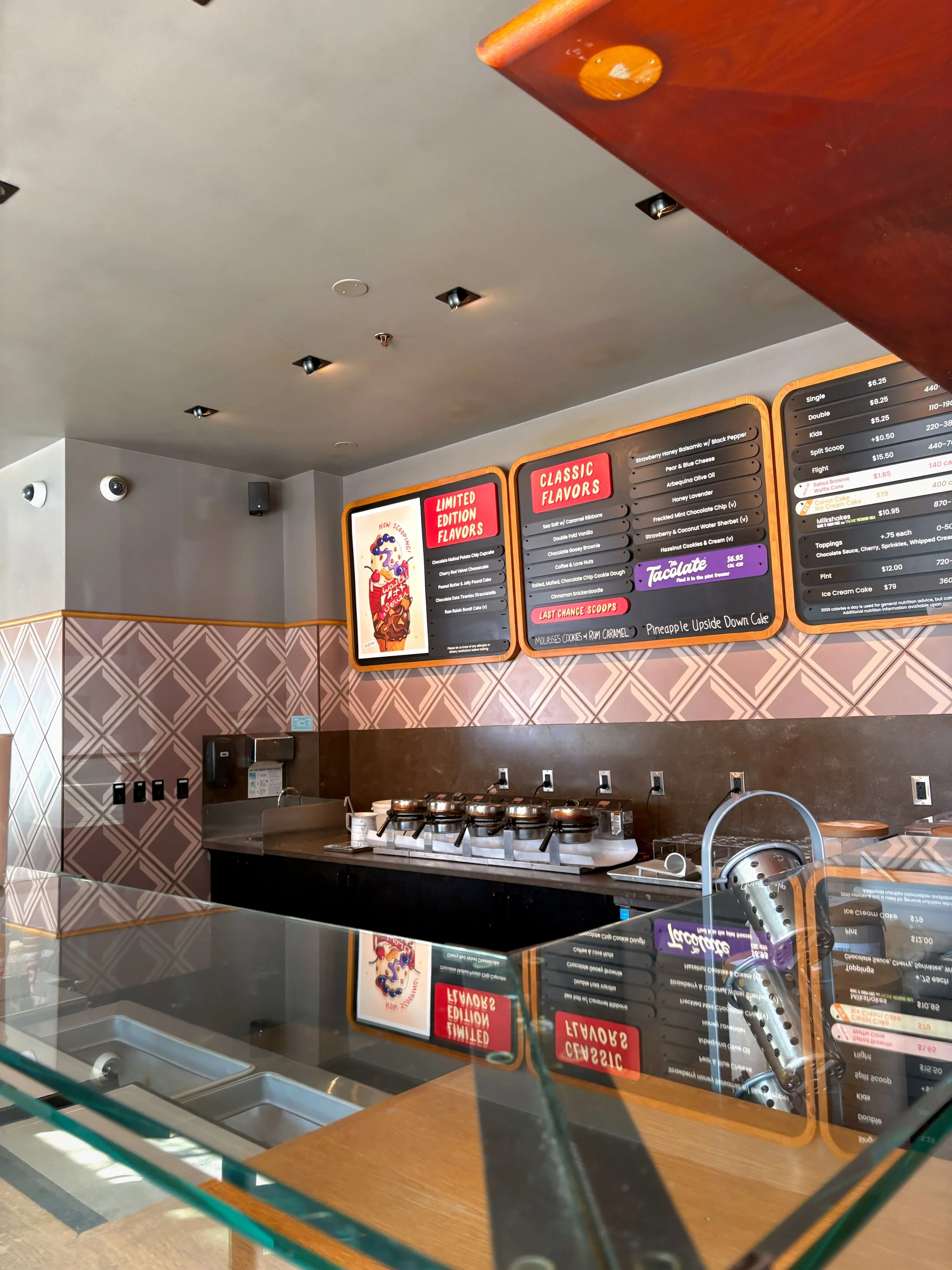
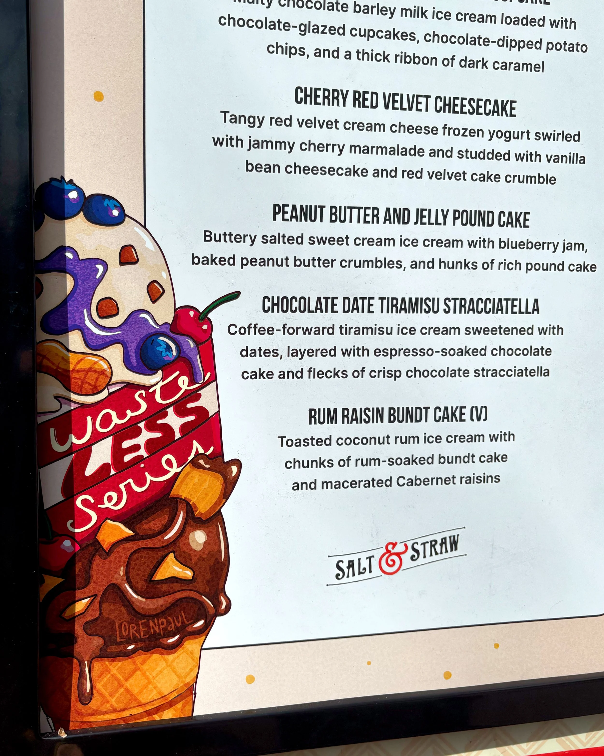
Salt & Straw “Waste Less” Series
Branded Illustration, Menu Design, Food Illustration
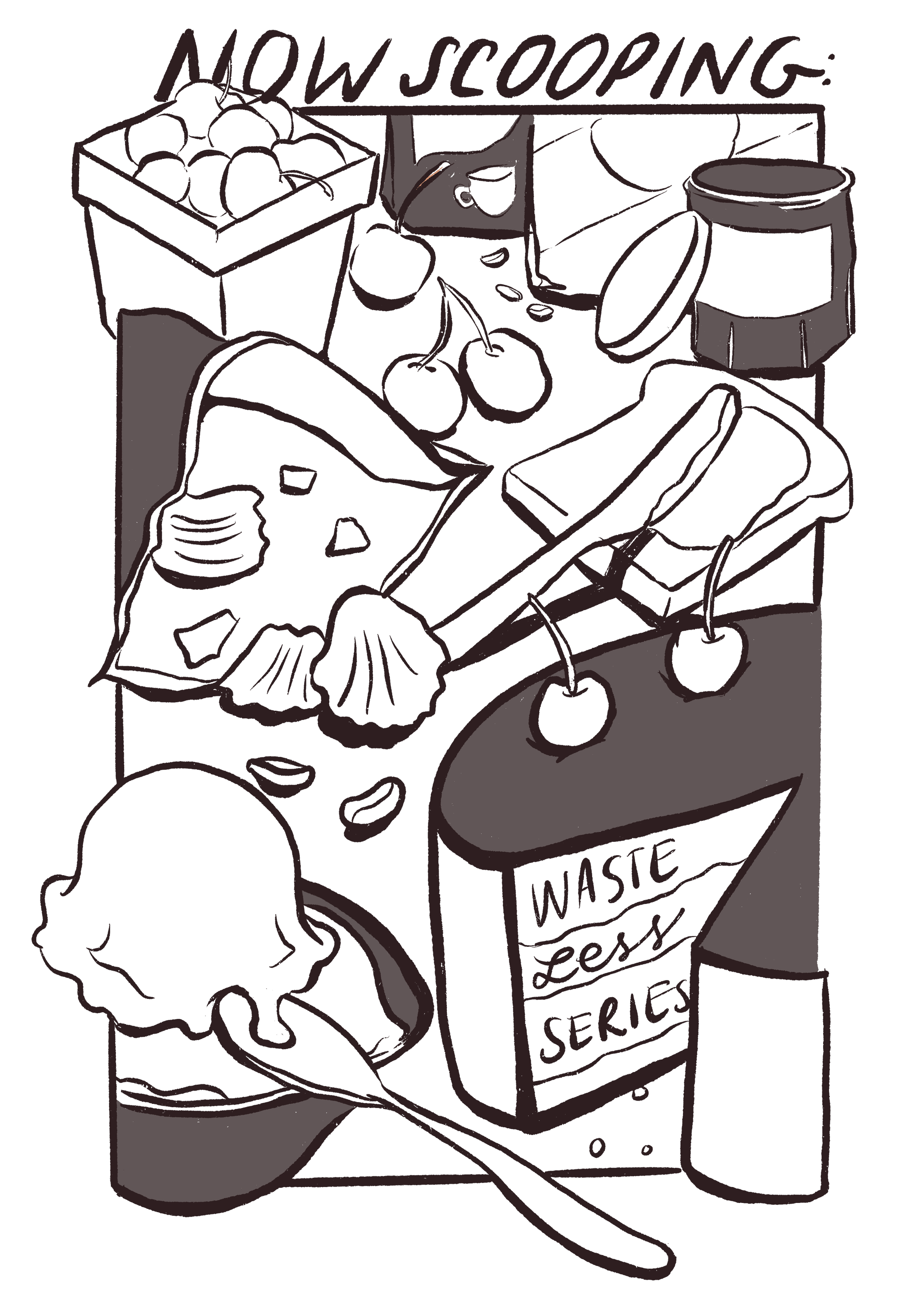
Salt & Straw approached me earlier this year looking to expand into illustrated graphics instead of their usual photography-focused branding.
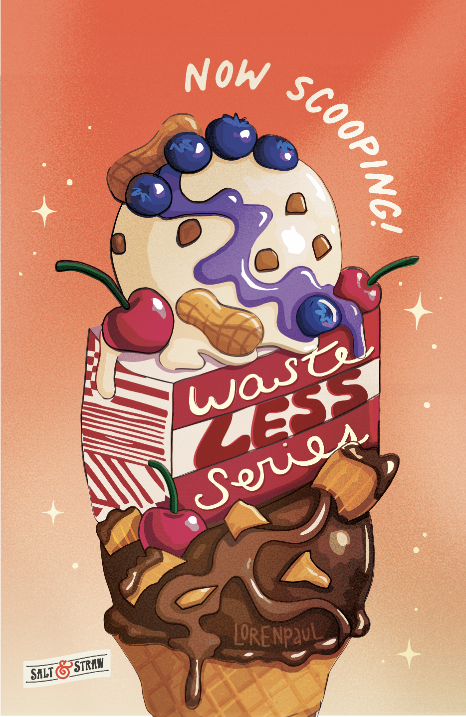
They were looking for a custom illustration by a local Portland artist to celebrate the theme for their upcoming quarter, “Waste Less.”
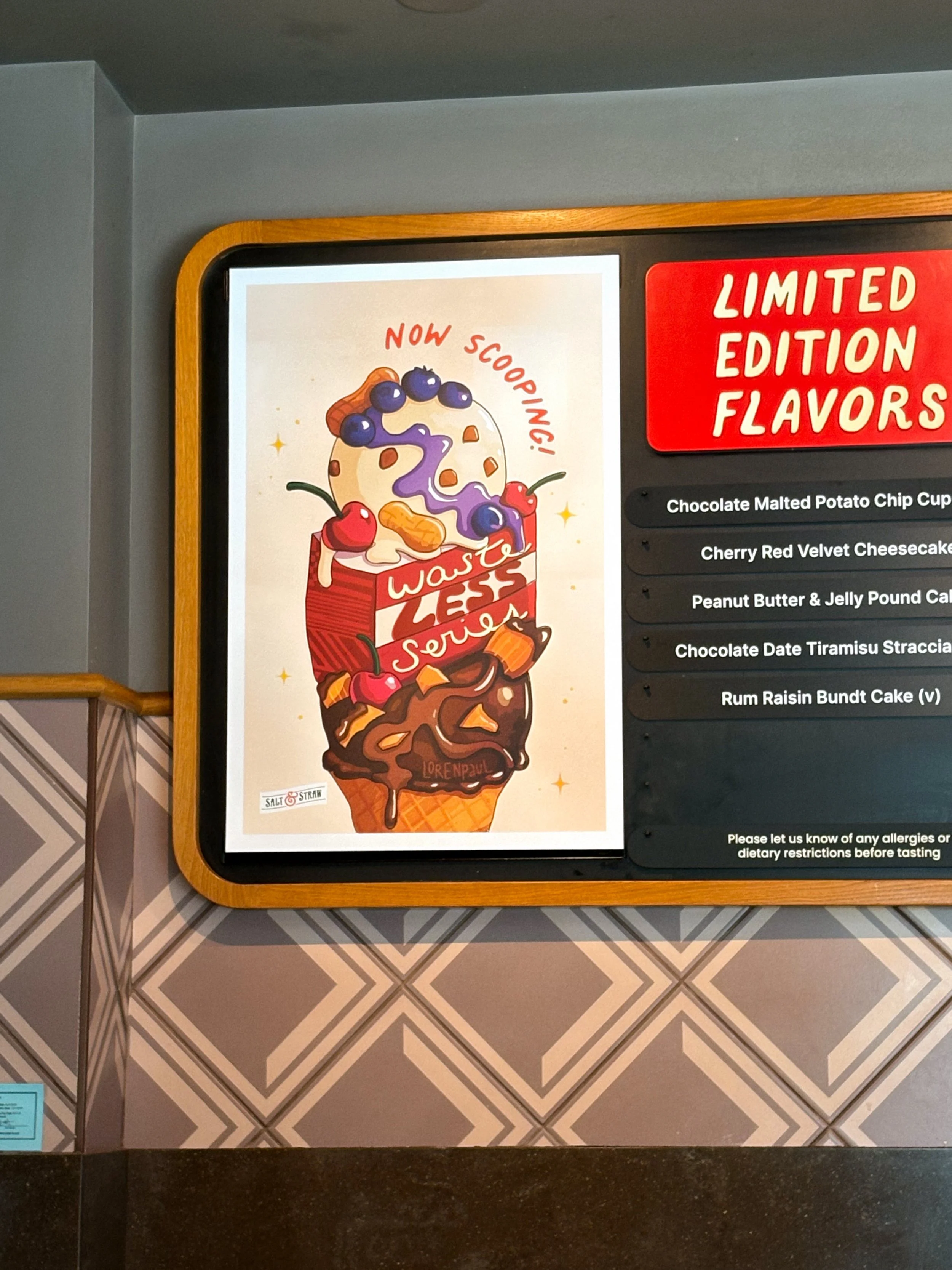
This theme is all about “rescued” ingredients — and finding creative ways to make memorable ice cream flavors in impactful ways.
The illustration needed to showcase several of the key “rescued” ingredients to highlight their partnerships with local organizations, look colorful and tasty to invite customers to try the new flavors, and uphold the classic Salt & Straw standards and branding requirements.
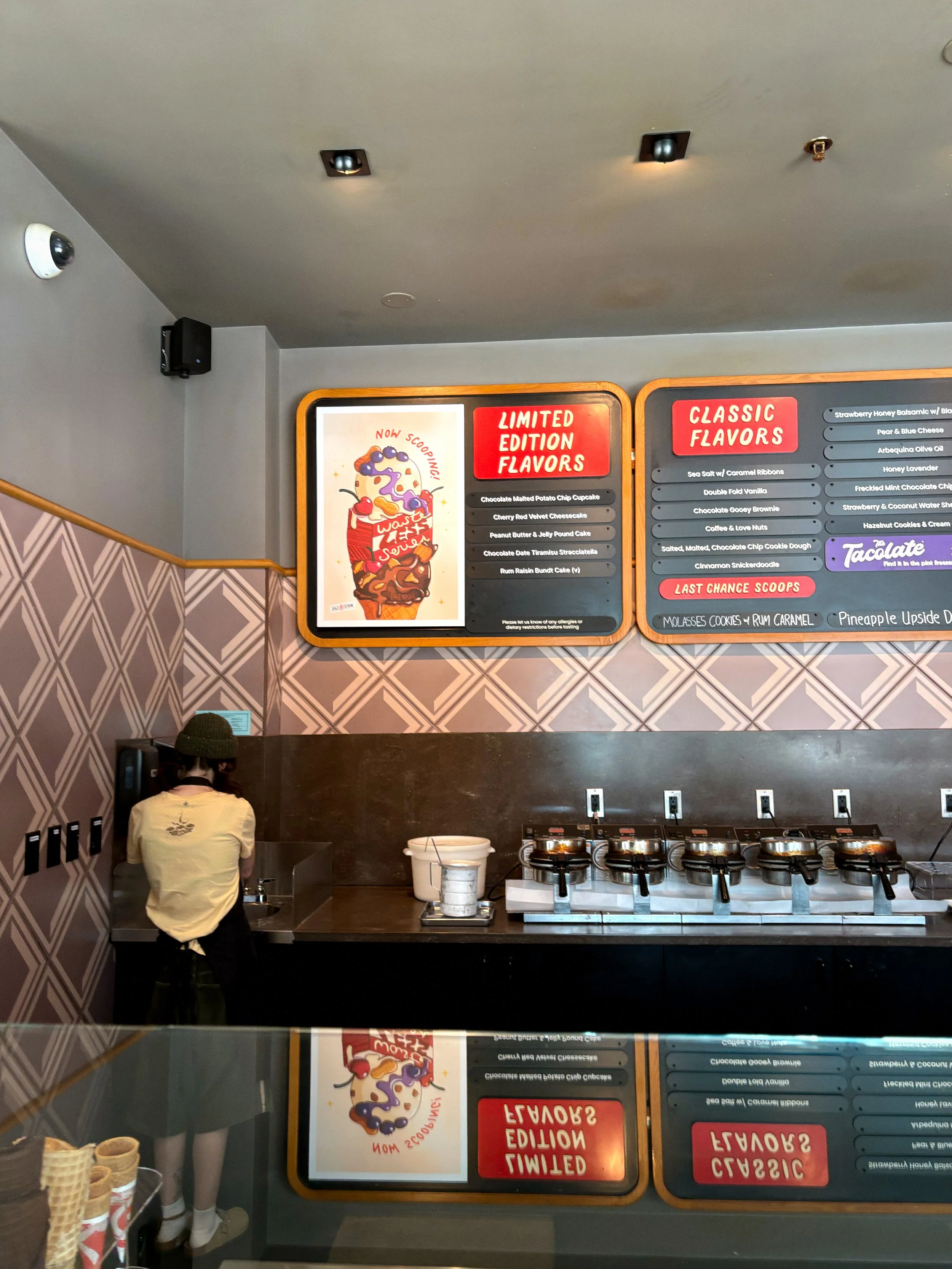
The final illustration could then be adapted to burst boards and menu boards for all 50+ Salt & Straw locations across the country.
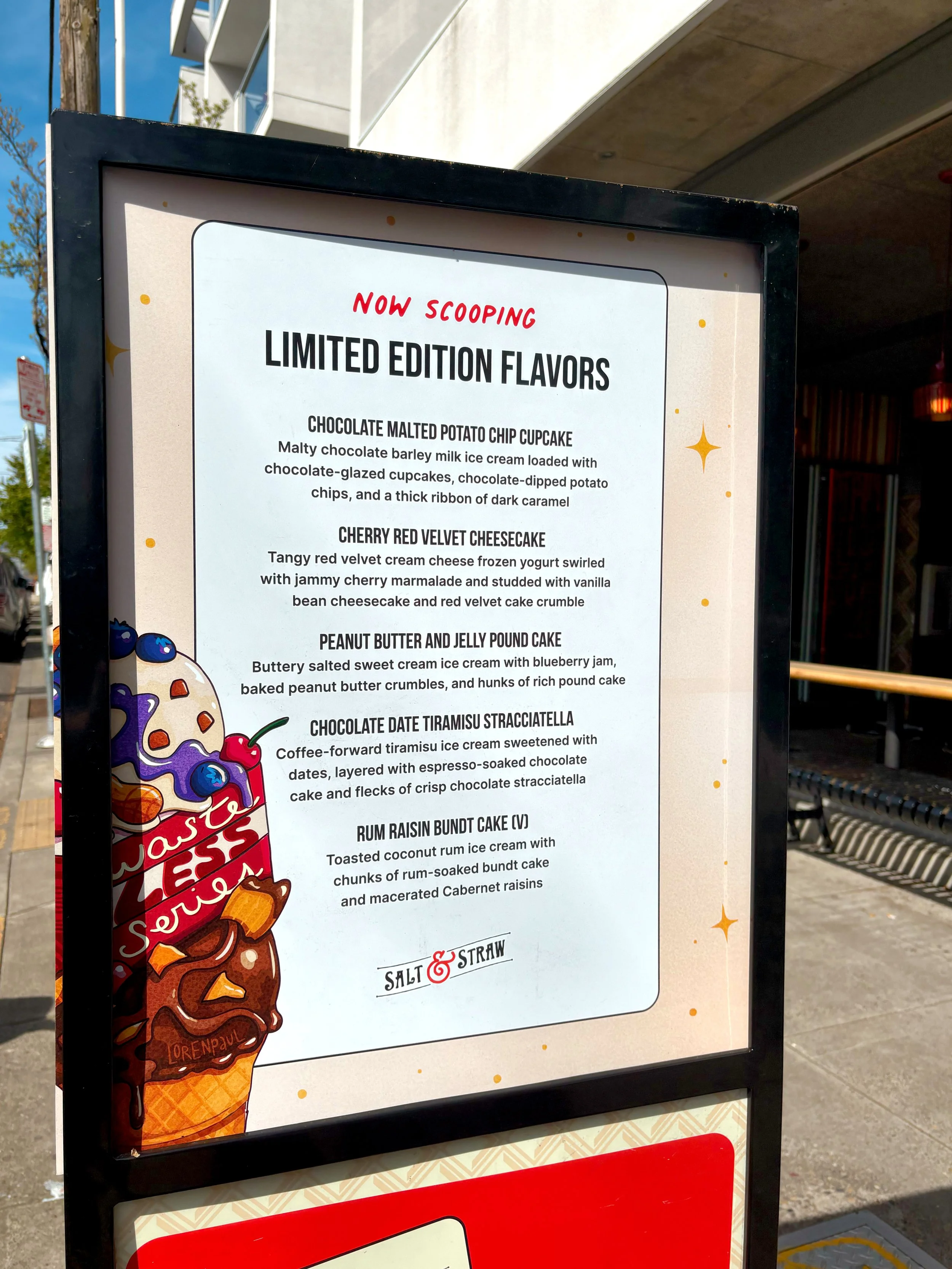
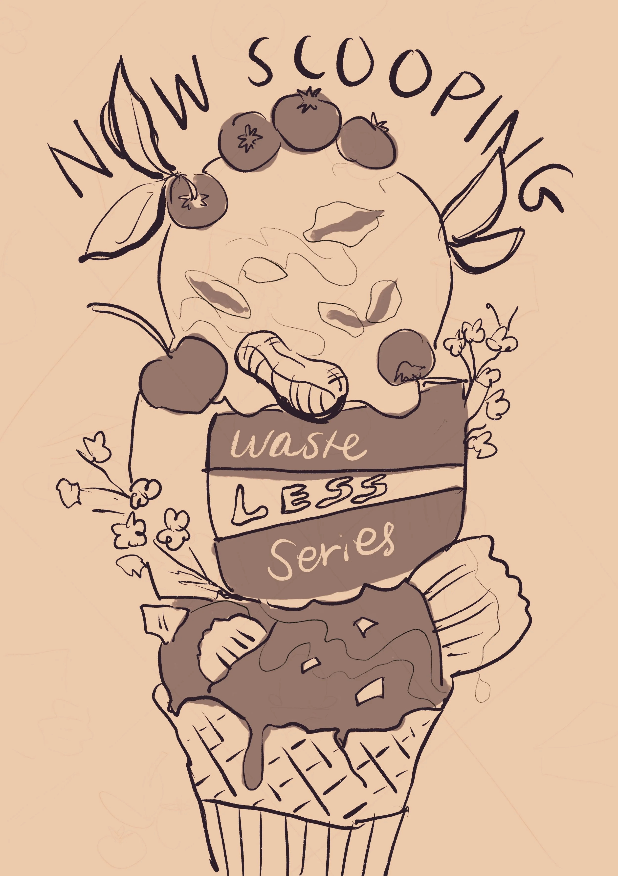
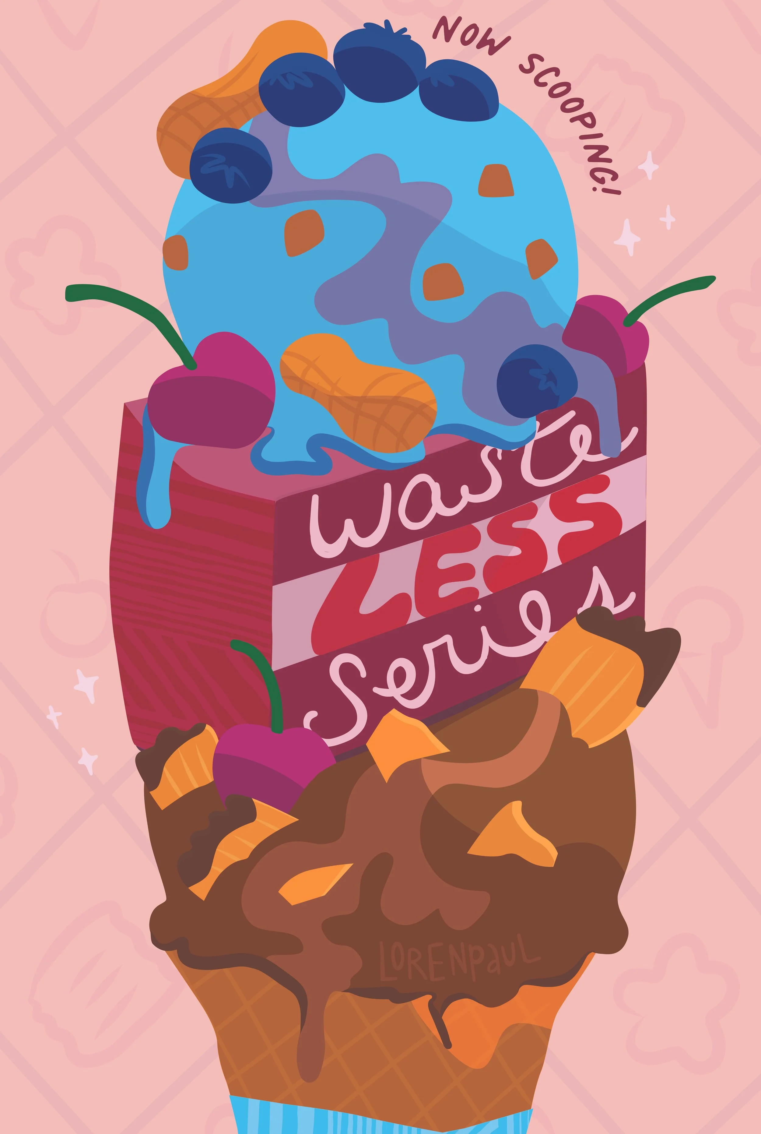
I worked to sketch, pitch, revise, and build the final illustration that is featured for this series. Working with a very specific vision and a tight timeline, what I am most proud of is the communication and collaboration that made this project possible.

The biggest lesson I learned from this experience is that the importance of clarity cannot be understated. Having clearly expressed roles, expectations, and outcomes is a vital piece of groundwork that can help a project move seamlessly, or struggle to progress.
I always want clients who work with me to know what to expect and when, and feel heard throughout the process — because design is personal!