I had the pleasure of working with this small business to create a completely new and updated look for their brand.
Nightingale Risk Management wanted a new logo to reflect their company values and unique edge in their field: a woman-owned, compassion-led security firm that is as approachable as it is effective at addressing its clients’ security needs.


The client naturally gravitated to the more organic marks, and particularly liked the bird in flight.
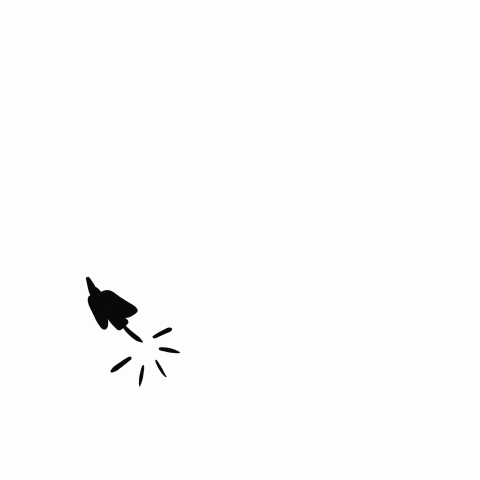
I designed the principal logo to feature the bird flying up, symbolizing confidence and assertiveness, while the organic lines brought accessibility and ease.


As a bonus deliverable, I animated the client’s logo for free use for social media and web purposes.